
Introduction
The project brief proposed the question, how might we design a mobile app to empower people to learn new vocabulary on the go? It can be difficult to keep track of new words, so language learners need a way to methodically categorize, reference, and study them. With Vagabond, users can create their own flash cards, practice conversational skills in partner lessons, and learn from different cultures.
Problem
Travelers, students, and language enthusiasts alike need a way to become more fluent in a foreign language on the go.
Hypothesis Statement
We believe that by designing a language learning app supported with conversationally focused lessons, review games, and cultural insights, we will create an immersive language learning experience.
Role
UX Designer
Duration
1.5 month
Tools


Overview
Vagabond’s design was developed using the Lean UX method. Its build-measure-learn cycle provided prompt solutions while researching and ideating within a small time frame. Below describes the main sections for this case study’s presentation.

Defining the Problem
Defining a problem to solve by understanding the current market

Understanding the User
Learning the habits, goals, and expectations of potential users

Foundational Design
Visualizing the steps needed for users to complete their tasks

Usability Testing
Observing the user experience to better inform design decisions

Refining the Design
Implementing revisions to reduce issues such as friction and cognitive overload

Retrospective
Analyzing the process for insights to guide future endeavors
Defining the Problem
The language learning app market’s current issues and solutions were explored to better understand the problem space. To do this, three competitors were analyzed: Babbel, Mango Languages, and Duolingo. User interview questions were developed based on these findings.
Competitive Analysis Overview


Mango Languages
Duolingo
Babbel
User Flow and Appearance
The color scheme for the UI Design was primarily black and white. This made the experience similar to reading a textbook, which could make it harder to maintain the user's attention.
Course Content
Duolingo is very engaging and its friendly aesthetic compliments the app's information architecture. Duolingo’s creative animations adds to its encouraging gamification.
Babbel feels minimal yet engaging with its micro animations and clean organization. Having review activities in the user's lesson timeline prompts the user to review previous lessons.
Lessons teach full sentences at a time with long passages of grammar for explanation in the trial lesson. If the grammar pages were broken down into smaller pieces, the lesson content might be more digestible.
Users can start learning from level 1 or test into a higher level. The lessons build upon knowledge that has been solidified over time. The variety of activities prepares users to adapt to different speaking situations.
Language settings are flexible, allowing users to set their own level and daily goal. Their process of building upon a few words at a time for lesson dialogue can create a reassuring learning experience.
Conclusion
While Mango Languages does provide the core language learning elements, it lacks diverse learning tactics.
Duolingo has found a way to make extensive coursework digestible and approachable for users of all levels.
Babbel’s user experience is content rich with a streamlined appearance so users can learn efficiently in minutes.
Understanding
the User
Interviewees described their study habits such as making their own flash cards to review vocab unique to their life. Every person spoken with complained that most apps only help with memorization, not conversational skills. The interview results defined the behaviors, feelings and goals of the user personas Joanna and Ivan. The user flow charts depict the information architecture based on tasks Joanna and Ivan would perform.
User Interviews Overview
Graphic Designer

Behavioral Therapist

Software Engineer

What They Do
I write my own flashcards of the most common words and phrases.
I learn languages before and during my travels.
I repeat lessons to ensure I have a thorough understanding.
What They Think
I think most language apps’ approach helps more with reading than conversational skills.
I think applying new vocabulary to situations is better than focusing on memorizing random words.
I believe curiosity about new cultures keeps me interested in learning languages.
What They Feel
I get annoyed when I struggle to apply words I've memorized.
I feel motivated to study new vocabulary when it feels relevant to where I'm living or what I'm doing.
I feel frustrated not being able to show my personality in conversation when speaking a new language.
User Personas


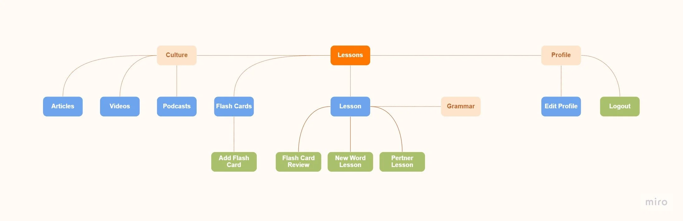
User Flows
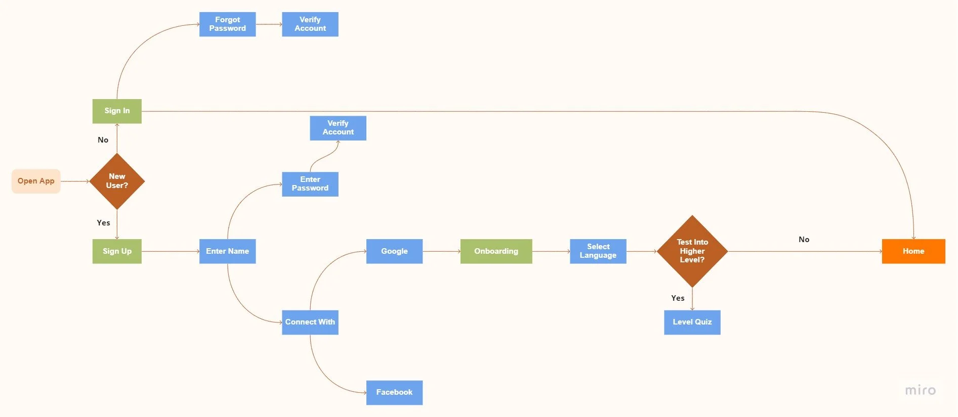
Sign In & Sign Up
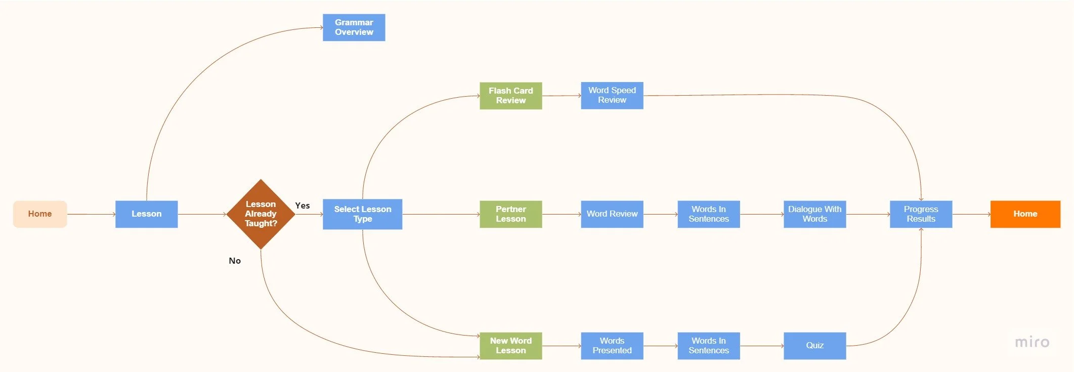
Complete a Lesson

Add a Flash Card
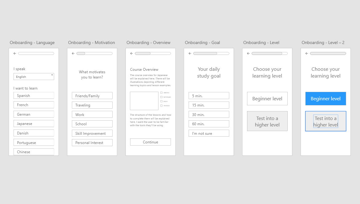
Foundational
Design
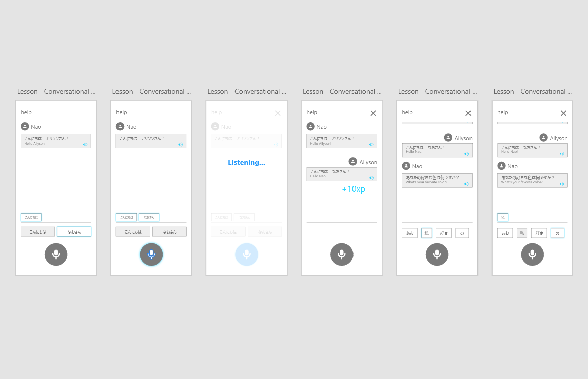
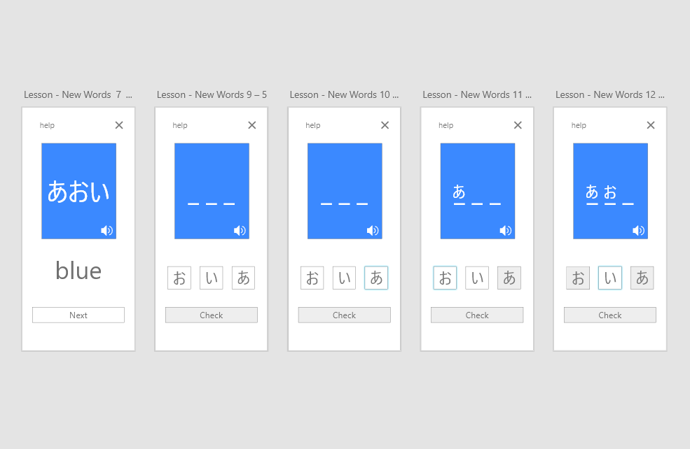
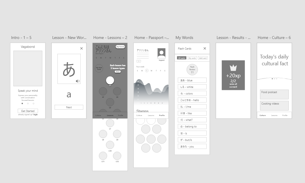
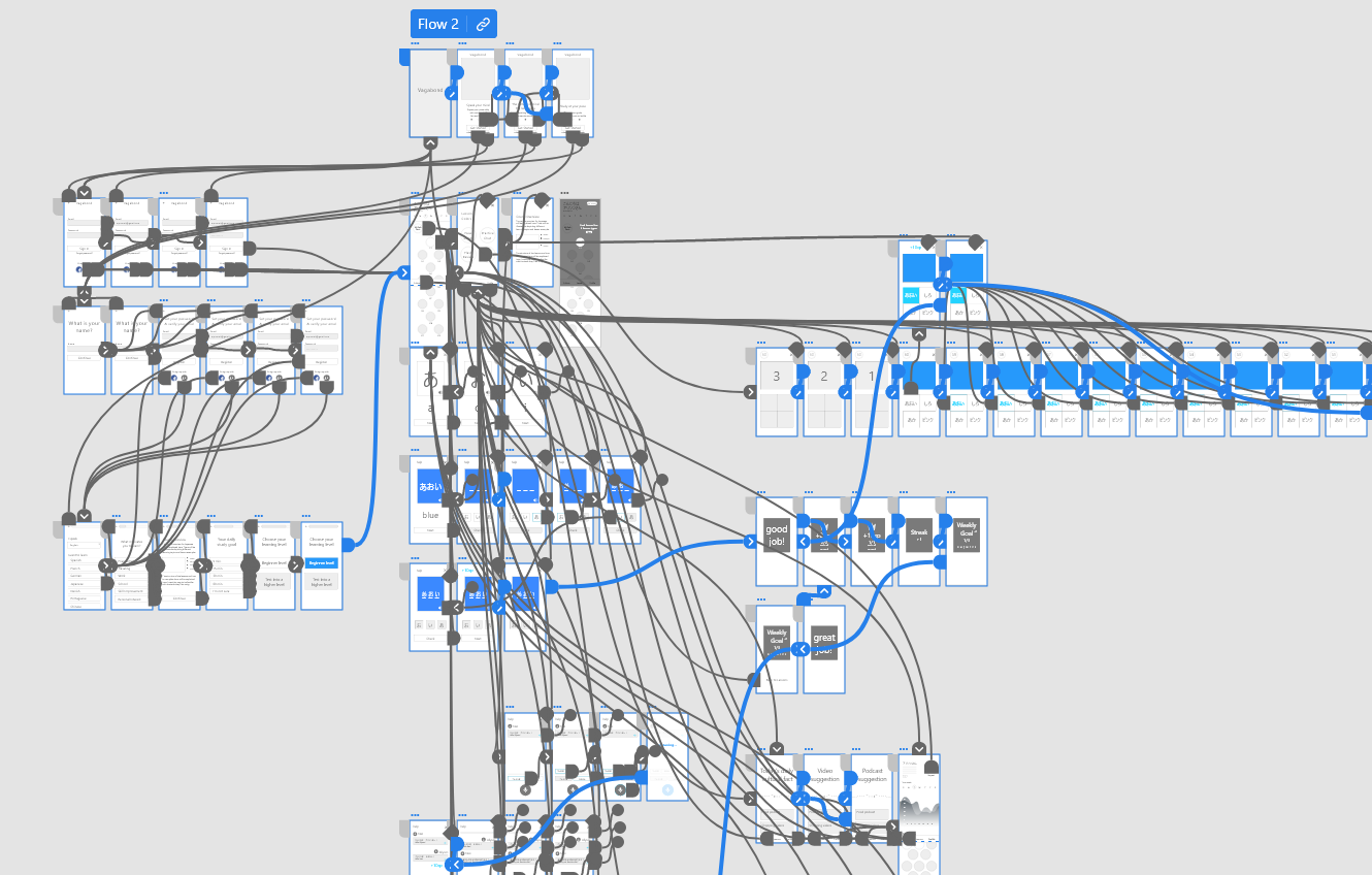
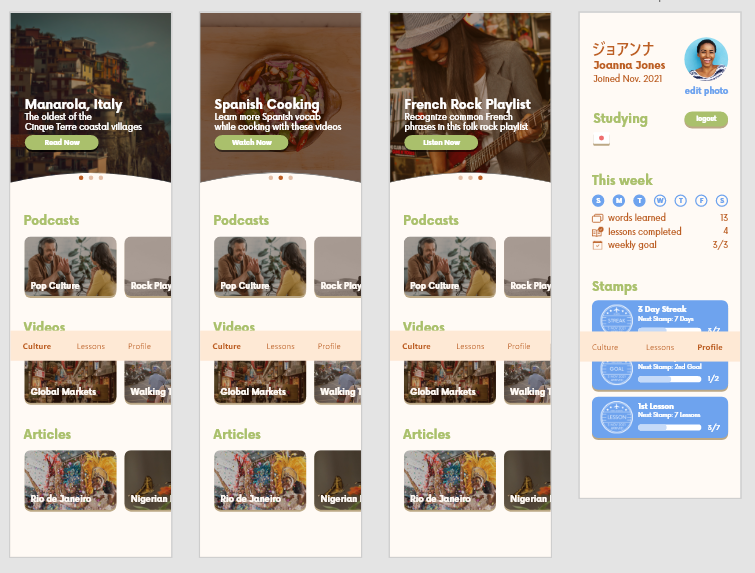
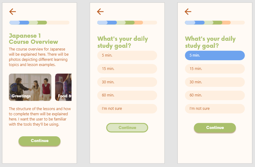
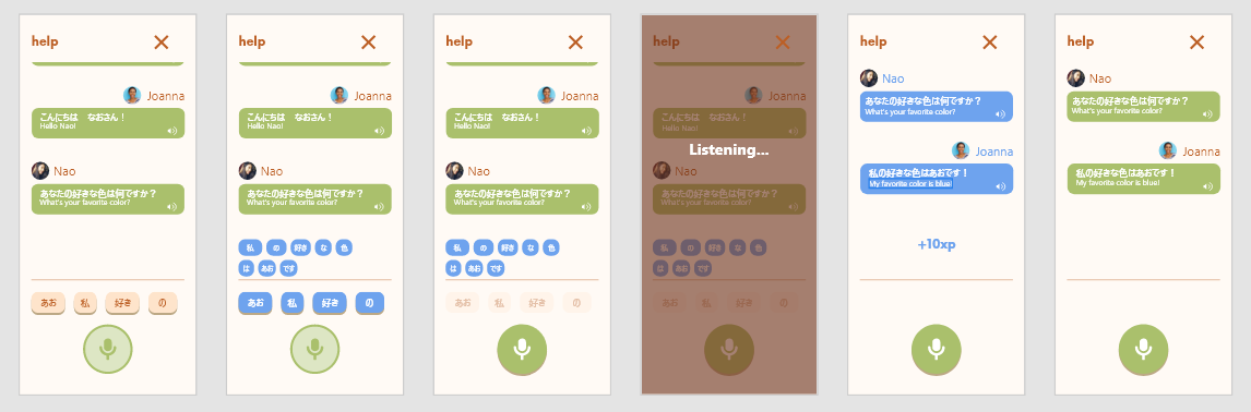
Many of the people interviewed felt that being immersed in another country's culture was the best way to learn a language. That inspired the name Vagabond. A traveling theme providing cultural information was designed to help foster an immersive learning environment. The initial sketches used the fewest actions per page that Joanna and Ivan would need to accomplish a task. As fidelity increased, finer details were added, such as micro animations to inform users during lessons and reward stamps to add gamification.
Initial Sketches
Initial Sketches


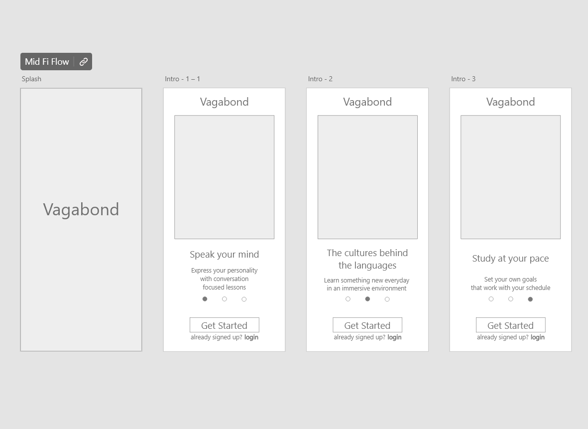
Mid Fidelity Wireframes
Usability Testing
Initially, the prototype’s language lessons had too much content, making them too long for demo testing. Each clickable element was also highlighted to guide participants through each task. The highlight hints were removed and lessons streamlined so participants could make their own decisions while staying engaged. Usability testers were led through task scenarios to observe their experience with Vagabond’s main features. The only friction testers experienced was being unable to locate the fact of the day when asked. For this reason, navigation bar instructions are now included in the onboarding process.
Task Scenarios
1. You did it, you just booked your trip to Japan. Excited, you start researching for traveling essentials and stumble upon Vagabond, a language learning app. You've never studied Japanese before, but this might be the place to start. Please setup an account to learn Japanese.
Follow up: Seeing as you have some extra time before bed tonight, you decide to learn some words from lesson 1. Please complete Lesson 1's New Words lesson. Logout
2. Watching anime you hear a new word you want to practice later. Please login and add your own flash card to Vagabond.
3. You're chatting with a friend about your upcoming trip and you want to show them you've been studying Japanese. Please login to show them your progress stats and rewards.
Follow up 1: You explain how you've been learning a little about Japanese culture everyday. Please show them the fact of the day.
Follow up 2: Your friend is impressed and asks to see a lesson. Please complete Lesson 1's Flash Review lesson.
4. You've made a habit of studying with Vagabond over your lunch break. This is when you have the most time to study. Please login and complete Lesson 1's Practice Chat lesson.
Refining
the Design
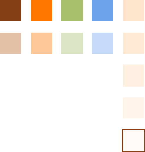
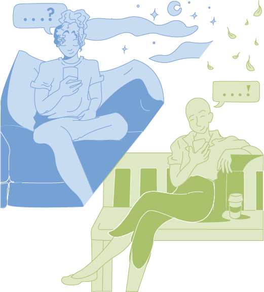
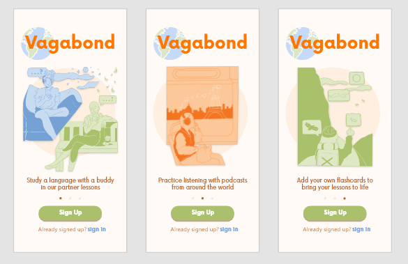
Since many of the interviewees studied vocabulary to prepare for travel, Vagabond’s color palette was inspired by travel photography and nomadic culture. In addition to complementing colors found in nature, warm neutrals are also easier on the eyes for studying. The orange, green, and blue pops of color draw attention to the calls to action and key information on each page. The illustrations were first sketched then added to Adobe Illustrator for coloring. They depict how Vagabond brings language learning to life by connecting users and applying lessons to their everyday lives.
Color Palette


Illustrations


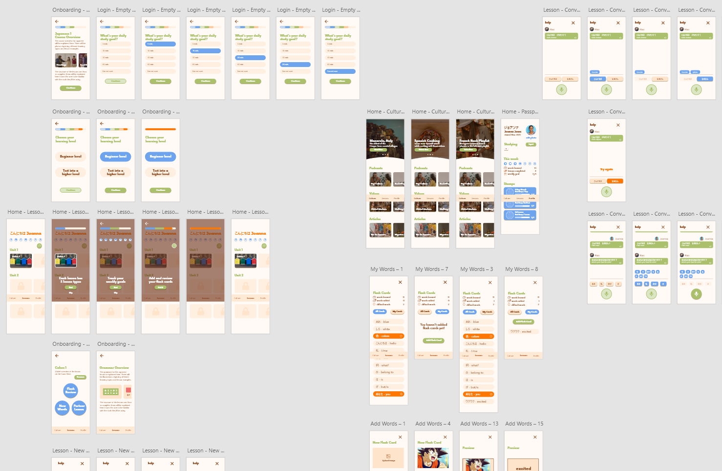
High Fidelity Prototype
Retrospective
Overall, Vagabond's core functionality aligns with the main objective of the project, however, more user feedback could help verify its high fidelity redesign. Usability testing and rapid prototyping will both be used to create a continuous feedback loop from potential users. This feedback will help define Vagabond’s brand identity and design system. As soon as the UI is well received during usability testing, a component library, style guide, and code snippets will be documented for a smooth transition with developers.