Community
Community is a wellness responsive web application that will promote local health services and provide Chicago residents with tools for tracking their health habits.
Introduction
An exhausted work force, global pandemic and the personal and general stresses of life have contributed to the current mental health crisis. Despite the health crisis affecting all Chicago residents, the administration of health resources has been nothing short of segregated. Chicago has one of the largest life expectancy gaps between blacks and non-blacks, and in 2019, it had the highest among US cities at 30 years. In 2019, Chicago’s mayor at the time Rahm Emmanuel closed half of the city’s mental health clinics leaving thousands without care. Historically, black and brown communities have been disinvested and left with few options for local health care due to a lack of funds, resources, and marketing. Community’s goal is to empower all Chicago residents to manage their health by adopting new healthy habits and having access to health care to improve their quality of life.
Supporting articles
Problem
Chicago Residents need access to health management tools and affordable local health services, because Chicago has one of the largest life expectancy gaps between neighborhoods among U.S. cities.
Hypothesis Statement
Providing Chicago residents with a health portal that allows them to manage their health and find local health services will help make health care more accessible to all.
Role
Product Designer
Duration
4 month
Tools


Overview
Community’s development process utilizes the Lean UX and Agile methodologies. The Lean UX build-measure-learn cycle provides prompt solutions during the design process. The Agile work flow will keep development flexible to new impactful findings while adhering to deadlines. Wireframes are currently being tested in Community's first round of usability testing. The sections below summarize the main points of this case study so far.

Defining the Problem
Defining a problem to solve by understanding the current market

Understanding the User
Learning the habits, goals, and expectations of potential users

Foundational Design
Visualizing the steps needed for users to complete their tasks

Usability Testing
Observing the user experience to better inform design decisions
Defining the Problem
The wellness app market’s current problems and solutions were explored to better understand the problem space. This was done by analyzing three competitors:


Google Fit
Headspace
Fabulous
Competitive Analysis Overview
Marketing

Google Fit aims to help "reduce the risk of heart disease, improve sleep, and increase overall mental wellbeing". Together with the American Heart Association, they created Heart Points so people can ensure they're getting the recommended amount of physical activity. Technology articles seem to be its main source of publicity. At the time of writing this analysis, it has appeared on websites such as Android Central, Android Police, and 9 to 5 Google.
SWOT Analysis

According to their website, Headspace's mission is "to improve the health and happiness of the world." Since their debut in 2010 as an events company, they have grown to provide virtual meditations for millions of people in more than 190 countries. When searching Headspace on Google, the entire first page only contains articles and videos created by Headspace. They seem to be less concerned with the press and instead focus on marketing their product internally.

Created in Duke University, Fabulous "uses behavioral science to help people make smart changes and build healthy habits." In order to foster long-lasting life changes, the app introduces new habits after people have reached their previous goal. Fabulous had the most paid ad search results of the three. Unlike Google Fit, which was mostly reviewed by tech sites, Fabulous was featured on health websites such as Health Line.

The greatest strength of Google Fit is its partnerships with both the AHA and 3rd party apps that it can integrate with. The development of phone camera technology has given them the opportunity to monitor the health of future users without requiring external devices like smart watches. As Google Fit is mostly reviewed by tech articles, this would likely increase their visibility among health related press.

Headspace Health, a subsidiary of Headspace, was launched through a partnership with Ginger. Besides strengthening their credibility, this will allow them to rebrand Headspace as a healthcare option as they await their FDA approval. Though they are gradually expanding their services, they could benefit from having more content for children. Headspace's top competitors, like Calm, offer a wide range of kids' content.

Fabulous' strengths have been overshadowed in recent years after their design team's plagiarism scandal. As well as their content being based on behavioral therapy and scientific studies, Fabulous' award winning designs set them apart from other wellness apps. Following its plagiarism of the indie game "Gris" for its character design and animations, Fabulous is turning this into an opportunity to rebrand and regain credibility.
Usability

Minimal in design, users are able to use Google Fit within seconds thanks to its simplicity. Within each activity category, users are presented with daily, weekly, and monthly visualizations of their progress. People can easily review all of their activity in their activity journal.

Thanks to the uniform organization across section pages, it's easy to find and use Headspace's features that suit each individual’s needs. The app seems to have little to no friction when completing tasks since there are only a few ways to view and listen to content.

Fabulous initially presents users with so many pop-up menus and calls to action, that it's difficult to navigate at first. Upon settling in, the organization of goals within set routines and the pleasant user interface are intuitive and user friendly.
Understanding
the User
Surveys and user interviews were conducted to better understand Chicago residents' experiences in seeking health care services and managing their own health.
Survey Goals
Interview Goals
To discover how users monitor and manage their health.
To learn how often they seek mental, physical, and emotional health services.
To understand the context in which users would track their health habits.
To discover why Chicago residents monitor and manage their health in the ways they do.
To document the the various obstacles for Chicago residents seeking physical, mental, and emotional health services.
To better understand how tracking and maintaining one's health habits would fit into the lifestyle of Chicago residents.
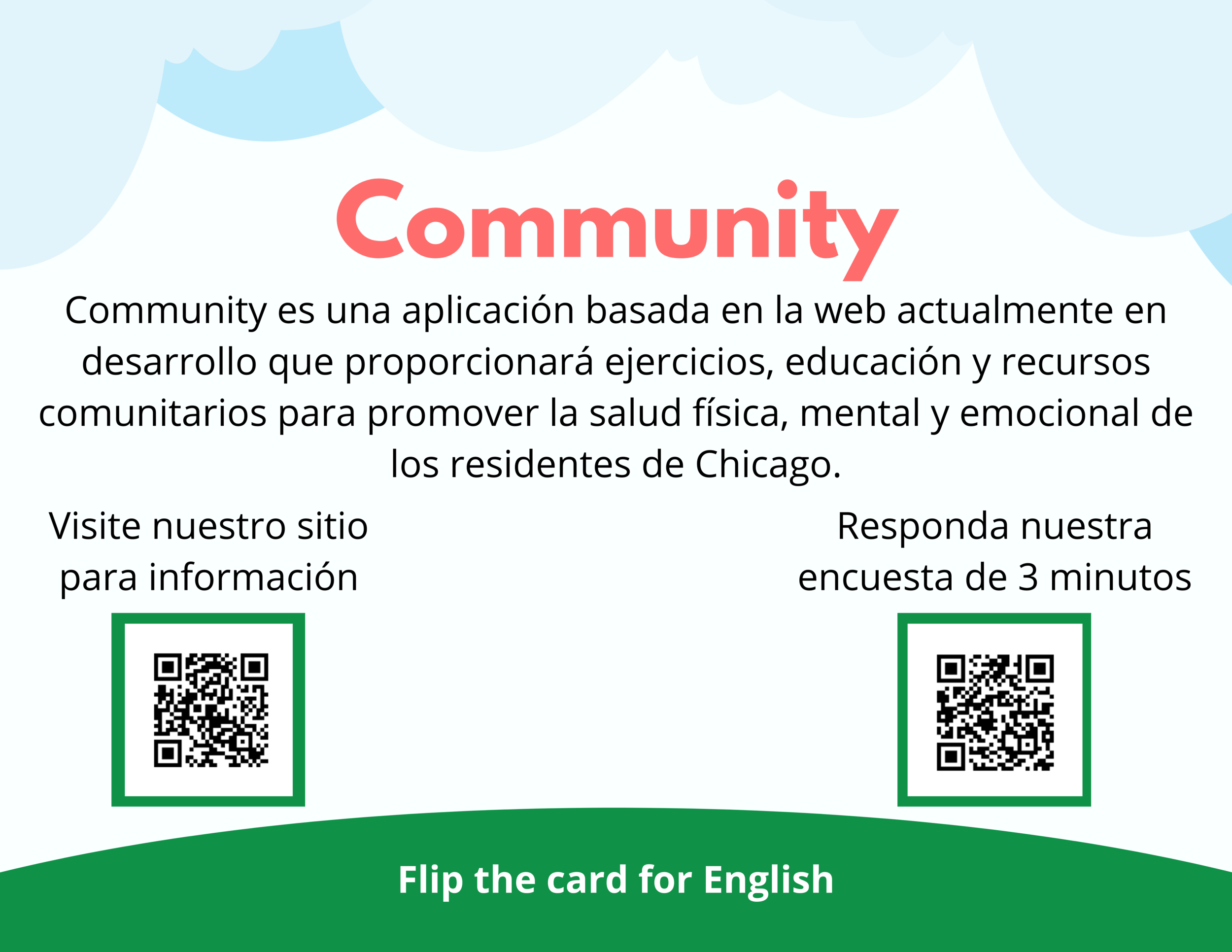
Survey Invitations
Chicago ward #35 will be the first neighborhood to test Community’s features. These cards were distributed in health clinics and libraries in the area.

User Interviews Overview
Healthcare Professional

Yoga Instructor

Comic Artist

Collective Behaviors & Attitudes
Findings
Everyone had their own stress coping mechanisms and healthy habits despite not having specific health goals.
Everyone wanted more consistency with their approach to managing health.
Everyone had a different schedule.
Insights
Adopting useful and helpful daily habits seems more important than accomplishing larger goals.
No matter where people are in their health journey, consistency is a struggle.
People need tools that fit their schedule.
Solutions
Design functionality centered around the user's desired lifestyle rather than a large goal.
Use gamification when tracking users' habits to encourage consistency.
Make the user's options for activities and habits they can adopt modular so they'll fit into any schedule.
Collective Needs & Goals
Findings
Everyone wanted to strengthen their health related habits and skills.
Everyone wanted to learn more about specific health topics and education.
Even if they didn't have a main goal, they wanted to strengthen skills by following a plan.
Insights
Showing progress and improvements in their health journey will motivate people.
Providing education on health management tools can empower users.
Models of daily plans of health habits might inspire new healthy lifestyles.
Solutions
Celebrating users' health journey by rewarding them at milestones can help them see and appreciate their growth.
Providing an educational Q&A section with links to articles, videos, and courses can further empower users to make healthier choices.
Providing example daily schedules to follow can inspire users to adopt new habits.
Collective Frustrations
Findings
Most thought health services can be too expensive.
Some were interested in support groups but don't know how to join them.
Some felt like it takes them longer to achieve goals than most.
Insights
People need to find health services that are more financially accessible.
People are looking for social support for their health goals.
People might be encouraged by an ongoing health journey that has many achievements rather than working towards one large goals.
Solutions
Promoting free or affordable local health services can help users make their health a priority.
Connecting users by showing their fellow residents' progress and promoting local support groups and help people grow and learn together with confidence.
Having habit tracking achievements that are unique to each user’s progress might be more encouraging.
User Personas
The survey and interview results were used to develop user personas. Each user persona represents healthcare and wellness related wants and needs of Ward #35 residents.


User Flows
User flows were developed from tasks the user personas would need to complete to achieve their goals.


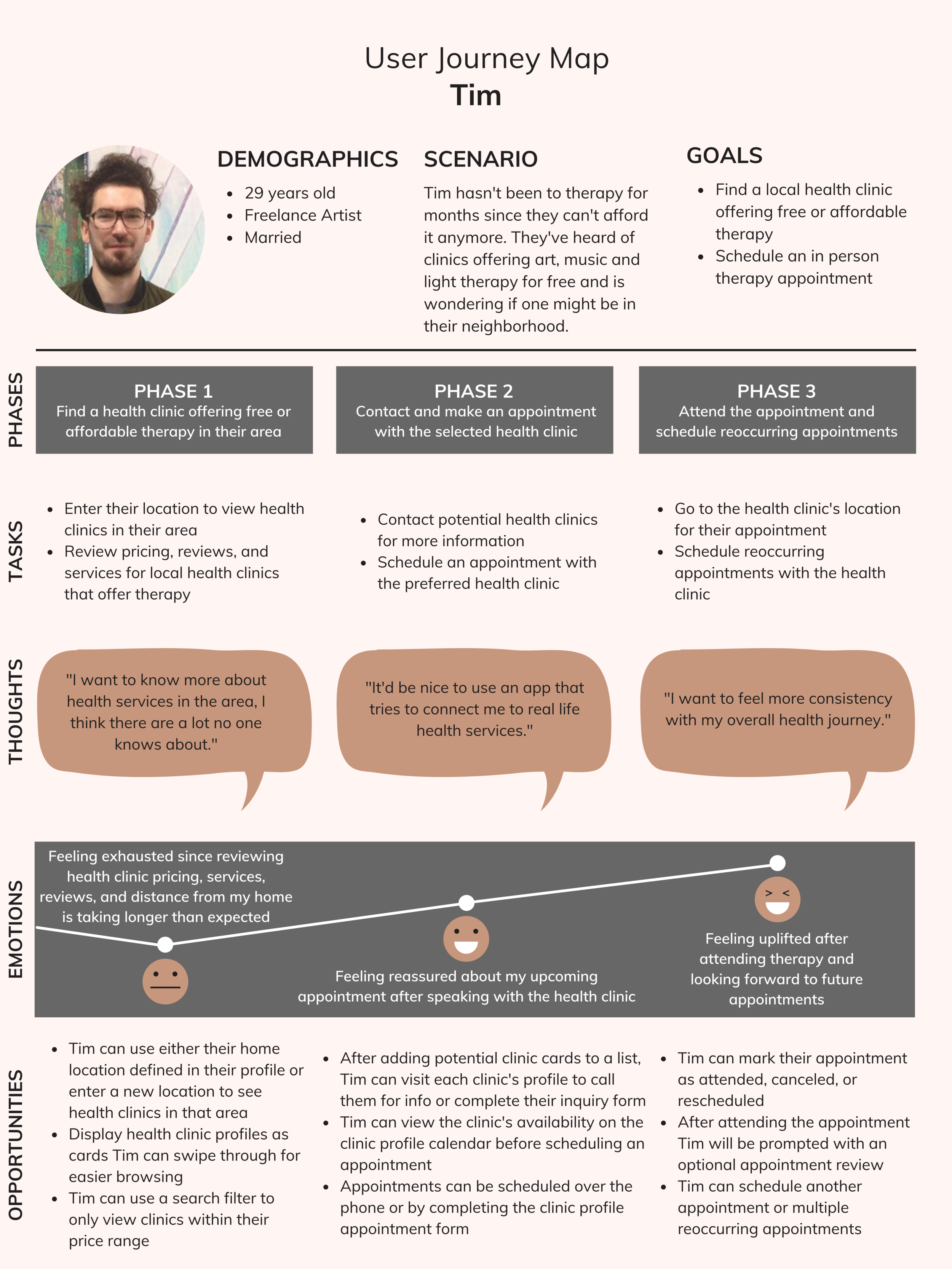
User Journey Maps
The potential experiences of user personas while completing these tasks was further analyzed in these user journey maps.


Sitemap
A sitemap was used to organize Community’s information architecture so that residents may intuitively complete tasks.

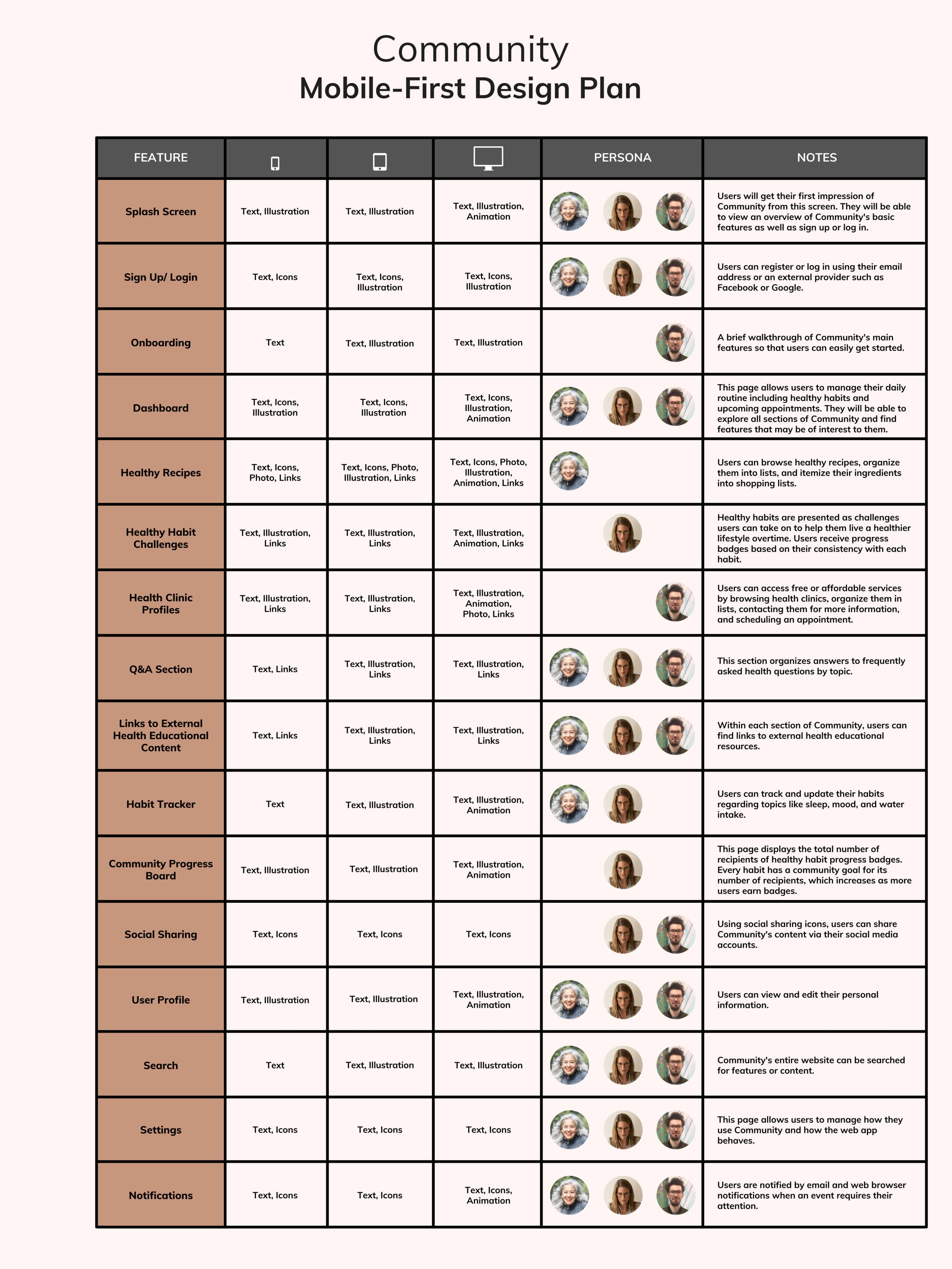
Design Plan
This mobile-first design plan further explains the content and functionality on each page.
Foundational
Design
Community’s design aims to make it easy for residents to get started, display medical information in an intuitive way, and create a pleasant supportive environment. The habit tracking in Community is displayed in a non-traditional manner, so a click-through tutorial was used to explain how it works. A progressive onboarding process will help keep potential users engaged and excited about Community.
Initial Sketch
While reviewing Community's main features, a community garden theme was created to help inspire growth and positivity.
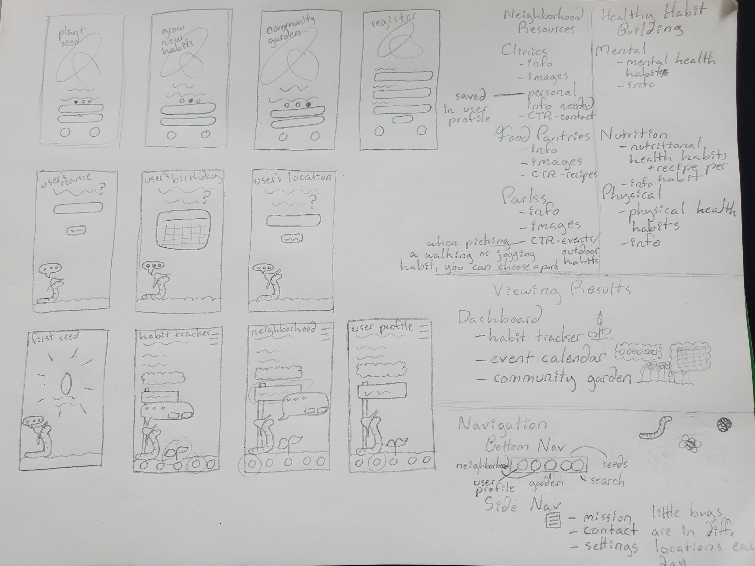
Low Fidelity Wireframes
With splash screens before the signup page, Community will explain how users are encouraged to grow with their community.


Mid Fidelity Wireframes
After the sign-up page, an earthworm farmer walks users through the onboarding process of the site explaining its main features.


Usability Testing
This study examined whether Chicago residents would find Community's features useful and easy to use. The goal was to discover what health information and services are most important to the neighborhood and how we can best raise awareness for them. Research recruitment was managed via Google Calendar Time Slots and Mailchimp E-mail Campaigns. The remote moderated test sessions were held and recorded with Google Meet Video Calls.
Results currently being reviewed